


From the standpoint of making communication more persuasive, the visual side of brand design is as strategic as the verbal, and arguably more powerful. When it comes to communicating the value of scientific innovations, even the most complicated science can be explained more clearly and more quickly through the use of visuals. Companies with innovations in the pre-commercialization stage must consider their visual design strategy early in a product’s lifecycle to better communicate its potential to investors, recommenders, regulators, and users.
The importance of visuals and shape is hard-wired in our brains. Research has shown that the majority of people are visual learners.1 The human brain acknowledges shape first, then color, then finally decodes content. This is known as the sequence of cognition. Understanding this sequence of cognition provides valuable insight and opportunity to create visuals that are highly effective for busy stakeholders, whether they are KOLs, potential partners, or investors. This makes building a visual language that can be applied to cartoons, information graphics, and the display of quantitative data essential in the business of healthcare and the life sciences.
These three visual strategies will clarify information and help stakeholders engage more quickly and act more decisively on the information provided.
1. Harness the Power of Color
Color is an invaluable asset for healthcare brands. A distinctive color palette not only evokes emotion, differentiates, and clarifies—it helps build brand equity. People make up their minds about a product within 90 seconds of their initial interaction, and 62% to 90% of that decision is based on color alone. Understanding the meaning and associations of color can increase the effectiveness of a brand.
Color’s psychological effect is instantaneous because it stimulates the senses, and its power of persuasion can lead to action. Researchers at the University of Missouri recently verified that colors used in a company’s logo have a significant impact on how the brand as a whole is viewed.2
In addition, Neuroscientist Bevil Conway, PhD believes the science behind how humans process color to be very powerful. “Knowing that humans might be hardwired for certain hues could be a gateway into understanding the neural properties of emotion.”3
2. Harness the Power of Cartoons
Science visualizations, often called cartoons, are anything but funny. Whether displaying mechanisms of action (MOAs), the technical aspects of an innovation, or information about a disease, cartoons are an opportunity to convey the most important aspects of the innovation in a compelling, digestible way, starting as early as Phase II in compound development.
Cartoons help all commercialization team members tell a clear, consistent, distinctive, engaging story quickly. The faster a scientific innovation can be placed in a visual context that target audiences can quickly understand, the sooner its value can be appreciated.
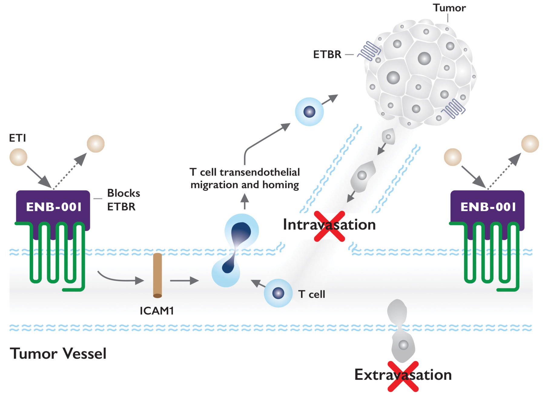
The mechanism of action (MOA) cartoon (Figure 1) illustrates:
ENB-001 blocks ETBR on blood or lymphatic vessels, which allows the transendothelial migration and homing of T cells from the vessel to the tumor. This allows T cells to infiltrate the tumor and kill it.
 When creating a cartoon, always consider your target audience. Cartoons created for KOLs are different from cartoons for investors or patients. One needs to be more highly scientific than the other.
A recently completed global survey4 of practicing oncologists asked, “On a scale of 1 to 10, how valuable are infographics or visualizations of molecular pathways/mechanisms of action in communicating a product’s features and benefits?” Oncologists scored the importance of cartoons as 8 out of 10.2.
Cartoons are strategic tools that help build business communication. By giving stakeholders a clear, simplified, memorable image that conveys features and benefits quickly, you can speedily spread the word that your product or innovation has value.
3. Harnessing the Power of Infographics and Data Visualization
You can tell people about an innovation and make them read a lot of complicated content, or you can show them a picture with concise captions. Because it’s estimated that more than 65% of people are visual learners, it makes business sense to incorporate infographics and data visualization into your content strategy.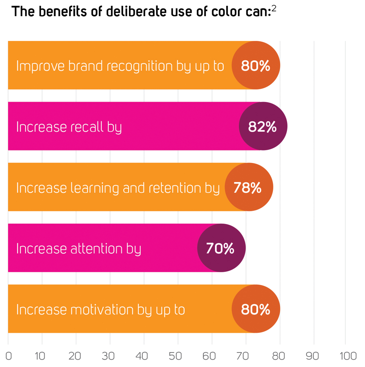
For example, we can use words to describe that a circle is a closed plane curve consisting of all points at a given distance from a point within it called the center.
Or, we can provide a visual that shows a circle which is quickly interpreted by our brain and is more memorable. Isn’t it easier and faster to recognize a circle from seeing it?
Infographics and data visualizations allow audiences to comprehend complex sets of relationships quickly. They make the information more memorable, and research has shown more people share infographics and data visualization, helping to spread your communication widely.
Three Key Benefits of Infographics and Data Visualization:
- They attract attention more than printed words, since they combine images, colors, movement, and content that naturally draw the eye.
- They improve comprehension of information, ideas, and concepts.
- They improve retention and recall.
Communication in the pre-commercialization phases using these three visual strategies are essential in the business of healthcare and life sciences by making a lasting, meaningful impression on your audiences. After all, you never get a second chance to make a first impression.
References:
- Lutz, Kathy A. and Lutz, Richard J. “Imagery-Eliciting Strategies: Review and Implications of Research.” Association for Consumer Research, 1978. http://www.acrwebsite.org/volumes/9492/volumes/v05/NA-05. Accessed December 2016.
- Xerox Corporation. “20 Ways to Share the Color Knowledge.” Xerox, 2014. http://www.office.xerox.com/latest/COLFS-02UA.PDF. Accessed December 2016.
- Gillett Rachel. “What Your Logo’s Color Says About Your Company (infographic).” Fast Company, 2014. https://www.fastcompany.com/3028378/leadership-now/what-your-logos-color-says-about-your-company-infographic. Accessed December 2016.
- Guard Dog Brand Development: Oncology Corporate Image Perceptual Index™ Selects Study. July 2015.