


Mobile can get complicated fast with all of the solutions available for marketers. To make things a little easier, here is a roadmap to help you choose the best tactic for your campaign.
It’s a great honor for this month’s Mobile Rx column to appear as part of PM360’s annual Digital Compendium. We thought we’d switch things up a little this month, foregoing our regular reader contributed questions in favor of a handy quick reference guide to the various mobile strategies and tactics we’ve covered so far.
Marketing used to be about three channels: print, radio and TV. Sure, there were some sub-channels within those such as out-of-home billboards or newspapers and magazines—and the differences between them. But all of these methods were essentially static, one-way, fire-and-forget mediums with no opportunity for direct feedback or optimization. Digital, on the other hand, is like an entire universe unto itself, replete with myriad galaxies of tactics and channels. And of that nearly infinite collection, none are expanding as quickly as mobile. I like to think of the mobile galaxy as running along a complexity spectrum, starting with the simplest solutions on the left and running through to the most complex on the right (Figure 1). I’ve broken the spectrum into three sections for ease of reference: websites, content and apps.
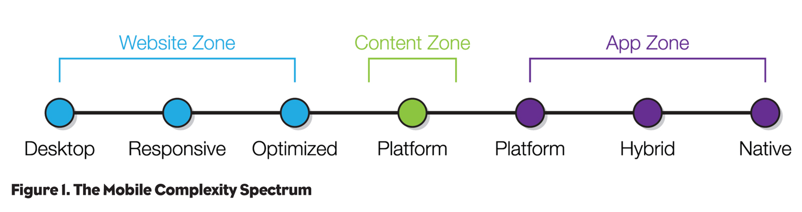
Websites
The simplest end of the spectrum—the Website Zone—is really about delivery of HTML content to the web browser on the device.
Desktop
There’s a growing school of thought around simply letting the device figure out what to do with a well-constructed desktop site, particularly on tablets. Most modern smartphone and tablet browsers do a really good job of handling desktop sites, equipping users with the ability to double-tap to zoom into content and to interact with embedded media and elements with gestures. If you have a well-built desktop site that doesn’t use Flash for content delivery, the simplest thing you can do is to do nothing!
Pros: Doing nothing is really cheap and fast.
Cons: The least friendly approach for mobile users if they lack a good browser or your site renders badly.
Responsive
The next step along the spectrum is to augment your desktop site’s HTML and CSS with style sheets for various sizes and orientations of mobile screens. A so-called responsive site uses a feature of CSS called “media queries” to ask the browser about the screen’s dimensions and resolution and then selects the appropriate style sheet to format the content. Well-constructed sites have long aimed to separate the content (HTML) from the display logic (CSS), meaning that swapping the style sheet should allow for a completely different rendering of the same content.
Pros: Reduces ongoing maintenance by sharing content and code between layouts. Can adapt to lots of screen sizes and orientations enabling different layouts for portrait vs. landscape on smartphones, tablets and desktops.
Cons: Doesn’t account for completely different content and utility needs of mobile users. Can swell file sizes and complexity of code considerably to account for both desktop and mobile screens.
Optimized
Continuing along the spectrum, we come to mobile-optimized sites. Rather than simple changes to the display of the same content, mobile optimization is often a completely different experience focused around the mobile user. These sites can often be driven by the same underlying content management system as their desktop cousins, simplifying ongoing maintenance. But they use a completely different codebase to deliver to mobile. Providing a persistent switch to the full desktop site gives mobile power users the best of both worlds.
Pros: Can give a highly focused experience for mobile users that delivers the perfect balance of form and function.
Cons: Requires separate maintenance of desktop and mobile code bases.
Content
Sometimes you want to deliver content to a mobile platform without worrying about building and maintaining your own content container. Welcome to the Content Zone.
Platforms
A number of third-party content delivery platforms exist that can be very useful for delivering specific types of content to mobile devices. Adobe’s Digital Publishing Suite (DPS), for example, is perfect for creating rich, interactive, magazine-like content experiences and easily pushing them to devices on iOS and Android. These tools are perfect for content-rich campaigns because they reduce your need to maintain code and rely on the platform vendors to do ongoing operating system compatibility testing and maintenance.
Pros: Lets you focus on content design and delivery without worrying about the container.
Cons: Can be restrictive in terms of features not offered by the platform vendor.
Apps
You’ve already got a mobile site and simply delivering content isn’t going to achieve your goals. It’s time for the App Zone.
Platforms
Much like there are third-party content platforms, a number of options exist for third-party app platforms that can greatly simplify the creation of cross-platform apps. Polar Mobile, for example, is great for simple apps that are driven by remote content feeds (e.g., RSS news feeds). The ability to compile Adobe Flash into platform native code on iOS and Android can make app creation simpler for seasoned Flash developers. PhoneGap enables developers to use HTML5 and CSS to build native apps.
Pros: Keeps app development faster and cheaper.
Cons: Reliance on third-party provider to keep platform up-to-date. Jack-of-all-platform apps are masters of none of them.
Hybrid
We covered our preferred technique for hybrid apps in last month’s column—the now infamous Peanut Butter Cup Approach. Once again, the chocolate shell is your platform native app wrapper that provides access to any device-level features that aren’t available in HTML5 (e.g., the camera), as well as handling any processor intensive tasks (e.g., 3D rendering). The peanut butter is shared HTML5 content available across platforms, optionally customized with platform-specific CSS files that reformat the display to match platform expectations.
Pros: Best of all worlds in that you get the power of native code combined with the efficiencies of HTML5. Peanut butter content can be used to form the basis for a mobile-optimized website.
Cons: Limits on the ability to have content display in a way that truly feels as natural as native.
Native
Lastly, right out on the edge of our spectrum, we have the completely native app. This is built in development tools provided by the mobile device vendor—XCode and Objective-C for iOS, Eclipse (or other third-party tools) and Java for Android. Most of the apps you use on your phone or tablet probably fit into this category (almost certainly true for games).
Pros: High-speed performance and a completely platform native feel. Access to all hardware features and the latest software features for each platform. If cost and time were not issues, this would be the way to go.
Cons: Need to build completely separate code for each platform. Up to you to maintain compatibility with OS updates from platform vendors. Testing on all of the available hardware and OS combinations can get really expensive (especially for Android given the number of device manufacturers).
That should cover the basics for all of the mobile tactics available. However, if that raised more questions or if you have a different mobile query, then let me know at jgoldman@klickhealth.com and stay tuned for more questions in the April issue.

