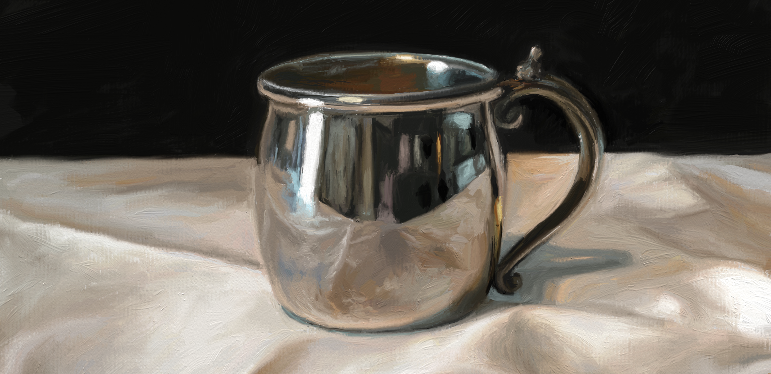

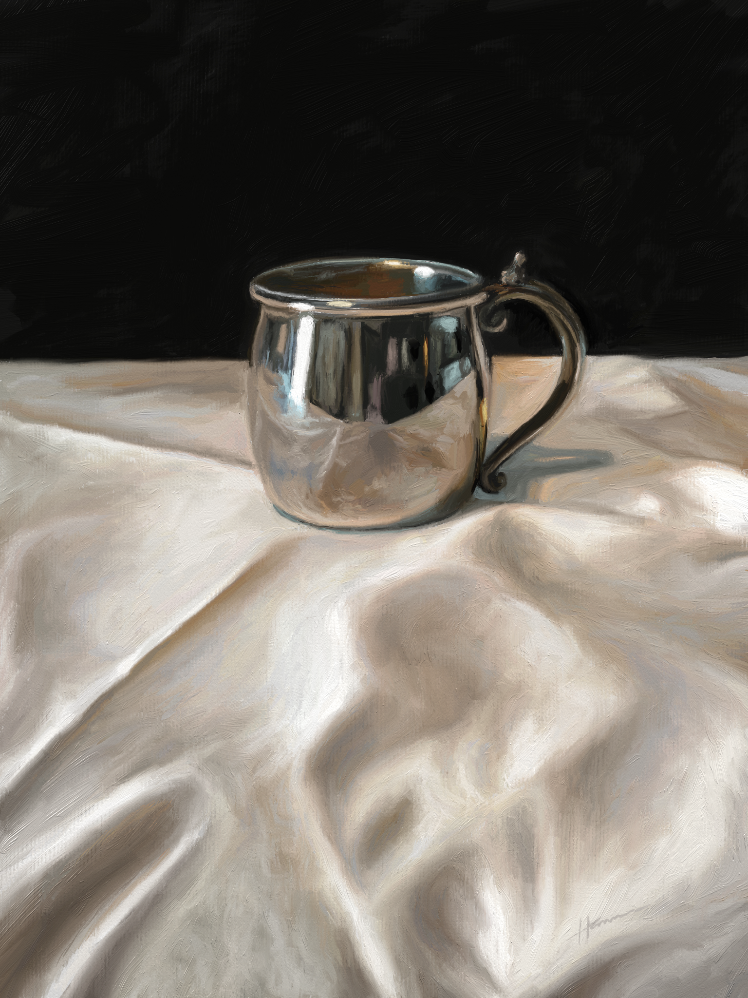
This year’s winner of PM360’s annual Greatest Creators cover competition for the best original artwork by someone within our industry is Shelley Hanna, SVP, Executive Creative Director, Wunderman Health for “Silver Cup.” PM360 spoke with Shelley about the selected piece.

PM360: What inspired you to paint this?
Shelley Hanna: I started painting again two years ago and discovered while posting my work on social media that people like and share paintings with shiny things the most.
This made me curious, so I found a little silver cup at a thrift store, created the painting, and sure enough it immediately started getting comments. I decided to do some research about this phenomenon and discovered psychologists believe humans are drawn to shiny things because our brains associate them with an innate need for water (https://bit.ly/2GPrmqi).
Beyond my curiosity around people liking shiny things, this composition contains a lot of symbolism. Visually, the contrast between a simple cup sitting on a table and the complex reflections on the surface draws the viewer in. The cup is a metaphor for life. It’s up to the viewer to decide what is contained inside and what the reflections mean.
 What was the process behind painting it?
My painting process can be summed up with a beginning, a middle, and an end. The beginning is full of hope and excitement. The middle is full of agony and self-doubt (a.k.a. the “ugly” stage), and the end, well that’s usually when I catch myself trying to get things too perfect and need to walk away. I don’t know if a painting is ever really finished.
How are you able to make the silver seem so shiny and realistic in the painting?
The secret is to paint what you see, not what you think you see. If I get too caught up in trying to make something “look shiny” instead of matching tone and value, then I will probably end up with something that is over-blended and over-saturated. Capturing correct tone and value is the key to painting realism.
Beginning artists tend to paint everything too bright—but it’s not their fault. Nearly every human on the planet is attracted to brighter colors. Walk through any grocery store aisle and see for yourself how marketers use this to capture consumers’ attention.
Are you working on any pieces you can tell us about?
I have a large portrait of a white German Shepherd I’m finishing up, one painting started featuring a decorative silver urn, and several studies I’m working on just for the fun of learning.
Where can people see other works you have done?
Currently my work is featured on my website (www.shelleyhannafineart.com) and social media channels (@ShelleyHannaArt on both Twitter and Instagram). I’m mostly concentrating on building a platform documenting how I paint, what I’m learning, and writing instructional blog posts about how I do things. This is a great time for artists to connect with other artists, grow in the creative community, and have their work seen by the whole world.